Interaction Polish: From Playable to Shippable
Life is Strange: Double Exposure | Systematic UI/UX Polish
TL;DR
Challenge: Create consistent, intuitive player interactions across a narrative game where UI clutter and unclear prompts were causing player confusion and blocking progression—all while approaching submission deadline with finished content and limited pickup opportunities.
Solution: Contributed to a 3-person strike team, establishing systematic standards for hotspot setup and personally addressing ~400 of the ~1100-1200 total hotspots polished over 2 months.
Impact: Addressed holistic gameplay flow issues through systematic polish, dramatically reduced playtest pain scores, and informed studio-wide pipeline improvements for future projects.
Overview
Joining Life is Strange: Double Exposure late in production, I saw an opportunity to address a critical pain point: player-facing interactions were inconsistent, confusing, and in some cases blocking progression. What began as straightforward UI consistency work evolved into contributing to a strike team that systematically polished interaction points across the game, establishing design principles that shaped how players navigate and engage with the dual-timeline narrative.
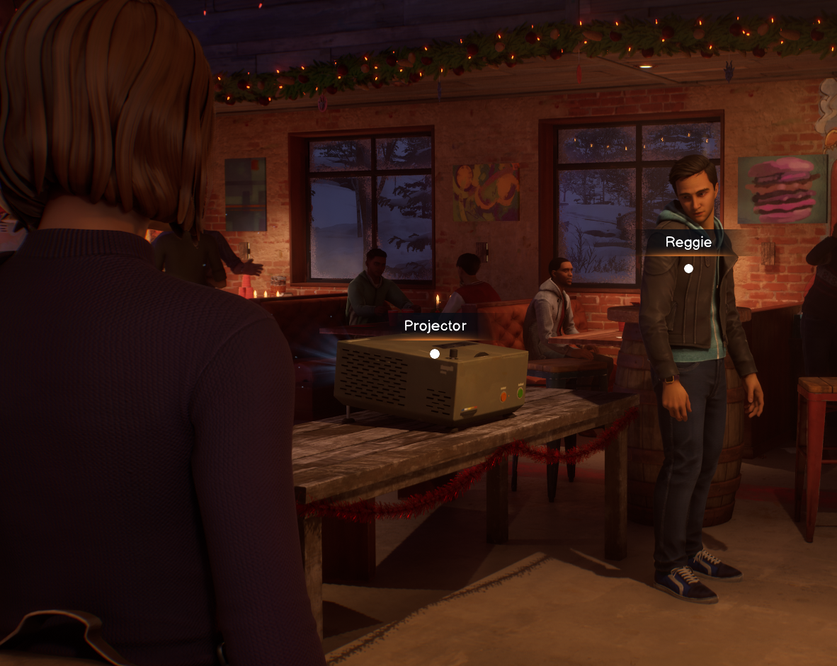
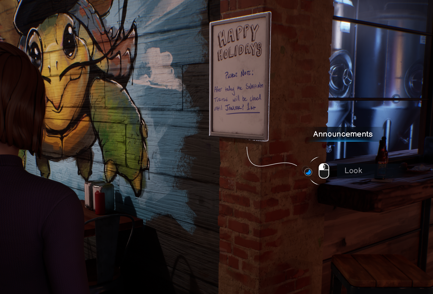
Final gameplay showing systematic hotspot polish in the Snapping Turtle: consistent verb usage, tuned proximity volumes, and breadcrumbing guide player exploration without UI clutter.
Situation
Late in production, the design team faced overwhelming pressure. Bug counts were high, some scenes weren't fully playable, and playtest feedback consistently flagged player confusion around interactions and progression.
Two specific problems emerged from playtest data:
Objective Confusion: Players struggled to understand their next goal, leading to frustration and stalled progression. While the root issue stemmed from unclear objectives, interaction language contributed—players couldn't distinguish between critical path content and optional exploration. Establishing consistent verb usage ("Examine" for critical path, "Look" for optional) became one way to alleviate this confusion.
UI Clutter and Misplacement: Hotspot volumes were mismatched with object locations, causing UI elements (dots, names, verb prompts) to appear in wrong places or show through walls. Players saw interaction prompts for objects they couldn't see, breaking immersion and creating navigation confusion. In hub scenes where players could freely move between levels, this ambiguity caused "ping-ponging"—players bouncing between areas unsure of their next objective.
The design team needed a systematic approach to unify how interactions looked, behaved, and communicated with players.
Task
The core challenge was transforming a playable but inconsistent game into a shippable experience where every interaction felt intentional and supported player understanding.
Primary objectives:
Establish consistent interaction language across ~1200 hotspots
Tune proximity volumes so interactions feel responsive without being aggressive
Reduce UI clutter while maintaining player guidance
Address holistic gameplay flow issues through systematic polish, allowing us to rule out interaction design as a culprit and get closer to identifying core problems
Constraints:
Late production timeline with submission deadline approaching (limited time for iteration)
All content was "finished"—pickup opportunities were valuable and limited
Dual-timeline scenes increased hotspot count and playtesting complexity
Technical limitations (changes required exiting play mode, risking crashes)
Small team (3 people) tackling the entire game
Action
Establishing Foundation: Dialog Options Pass
Before tackling freeform interactions, I completed a consistency pass on all dialog options during cinematics (313 instances across ~28 story scenes). The task was straightforward but revealed important principles: consistent placement reduces cognitive load and builds muscle memory.
Design Rationale:
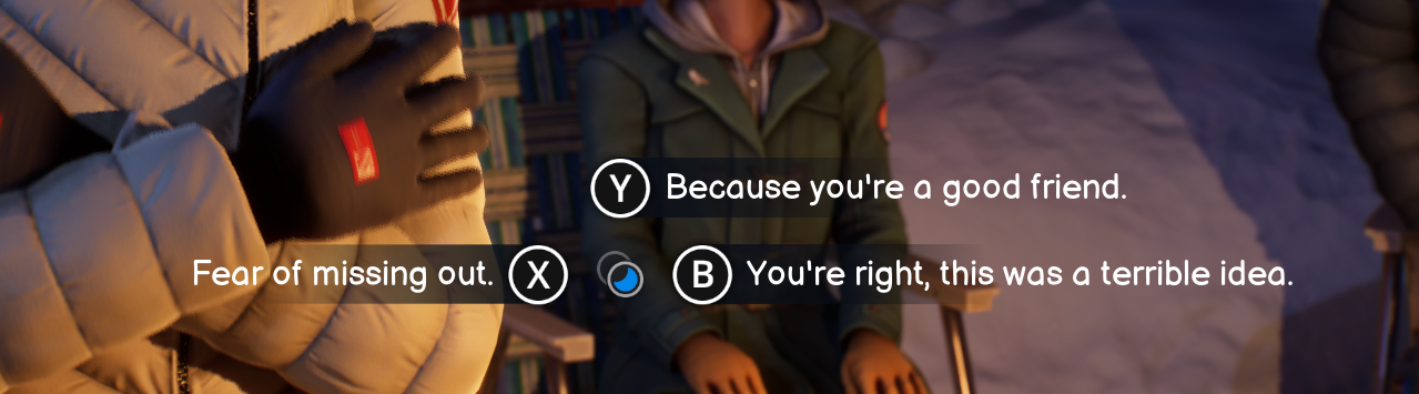
Dialog option layout: shorter text left, longer text right, leave conversation consistently bottom (when narratively needed)
Longer text on right, shorter on left: The player's eye naturally centers on screen. Placing longer text right creates predictable visual flow—a small dart left, then sweep right. This also addressed reading patterns and visual appearance next to controller button UI images.
"Leave conversation" always bottom: Maps to the A button (Xbox)/bottom button consistently, establishing input language players can rely on. This allowed players to always hit the same button to return to freerom.
Underline new options: Signals options unlocked by previous choices. Not all options were truly "new" on first conversation, so the underline communicated "you have this choice due to a past decision or action."
This wasn't just aesthetic—it was about guiding player decision-making through consistent visual language. The intentionality behind each placement became immediately apparent in team playtests.
Hotspot Strike Team: Systematic Polish
With dialog foundations established, I joined a 3-person strike team focused on polishing every freeform interaction in the game.
Our Mission:
Interaction distances feel right when players approach objects
Correct objects highlight with UI pointing accurately
Verbs are readable and don't obstruct objects
Important hotspots guide players from distance
Three-tier proximity system (dot → dot+name → full UI) creates non-aggressive guidance
Line-of-sight hiding prevents UI from appearing through walls
Iteration: Finding the Right Workflow
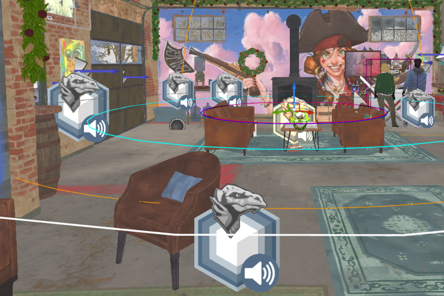
Example of hotspot density requiring systematic volume tuning and variable tracking
Initial Approach (Scene Size): We divided work by estimated scene size, trying to balance workload. This failed quickly. Scene size didn't correlate with interaction density—some large environments had few interactions while small spaces were dense with content. Dual-timeline scenes compounded this: some doubled hotspot count between timelines while others had significantly fewer in one.
Pivot (Location-Based Work): I suggested working by in-game location rather than scene. This accelerated my pace dramatically. By flowing through the same physical spaces (the Snapping Turtle bar, the Admin Building), I developed location-specific baselines for volume sizes. After polishing four Snapping Turtle scenes, I intuitively understood "in this space, use these distances." This freed mental bandwidth to focus on narrative needs and meaningful interaction flow.
Example: Volume Tuning
Finding the right proximity distances required extensive playtesting. Two extremes illustrated the challenge:
In the Bowling alley, a large artwork is far from the playable zone. Players could see it, but couldn't get close enough for interaction prompts to appear due to the environment layout. I expanded the verb UI volume significantly, allowing interaction from viewing distance, and increased the scaling on the UI dot, name, and Verb UI.
At the kitchen counter, high hotspot density created the opposite problem. Original volumes were so large that players could stand in one spot and interact with all hotspots, creating UI clutter and unclear targeting. I limited volumes to require closer proximity, forcing players to move around the counter—this clarified which object they were engaging with.
My process:
Enter play mode and note all hotspot issues
Exit (risking crashes in Unreal and our in-house tool Storyteller)
Implement changes outside play mode
Test again
I used PDF screenshots of each scene's hotspots with color-coded comments tracking changes between tests. This created a running dialogue with myself about what needed adjustment. While potentially slower than other team members' methods, it prevented me from losing track of which hotspots were ready and which still needed work.
Design System: Breadcrumbing + Cast-and-Hook
The three-tier proximity system (dot → dot+name → full UI) enabled two complementary guidance methods:
Breadcrumbing: Ensure players always see another hotspot dot when exiting their current interaction. This one visible dot then acts as the cast-and-hook, pulling players toward new regions of the map. This prevents "now what?" moments while keeping UI minimal, encouraging exploration—players discover content rather than simply chasing UI markers.
Why Three Tiers Create Better Experience:
Players don't need full interaction UI from across a room—it's visual noise. The dot is subtle guidance. As they approach, the name confirms "yes, this is what you think it is." Only at interaction distance does the full verb UI appear. This progression feels natural and non-aggressive while preventing the player from feeling lost.
We reinforced this with line-of-sight hiding: hotspot UI only appears when the player character could actually see the object. A dot showing through a wall for an NPC on the other side breaks immersion and creates false expectations. I wanted players to explore as their character, not chase dots. We included an accessibility mode that allows hotspot dots to always display for players who prefer that experience.
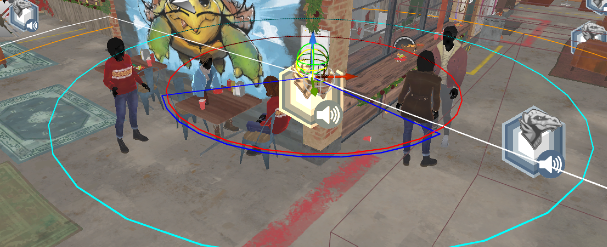
Custom blocking volumes for line-of-sight hiding: (left) editor view showing volume setup, (center) UI visible when player faces object, (right) UI hidden when view obstructed—maintains immersion while preventing UI clutter.
Verb Hierarchy: "Examine" vs "Look"
Originally, these verbs had no clear distinction, contributing to player confusion about what content was critical vs optional.
New Rule: "Examine" for critical path, "Look" for optional exploration.
Design Rationale: Some players only engage story-critical content. By using verb choice to signal importance, we helped these players (and really all players) follow the narrative through gameplay interactions. Correcting this language use directly addressed the objective confusion issues surfacing in playtests.
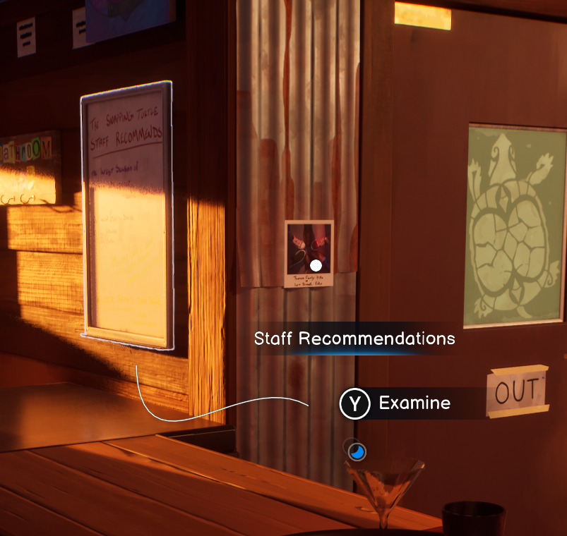
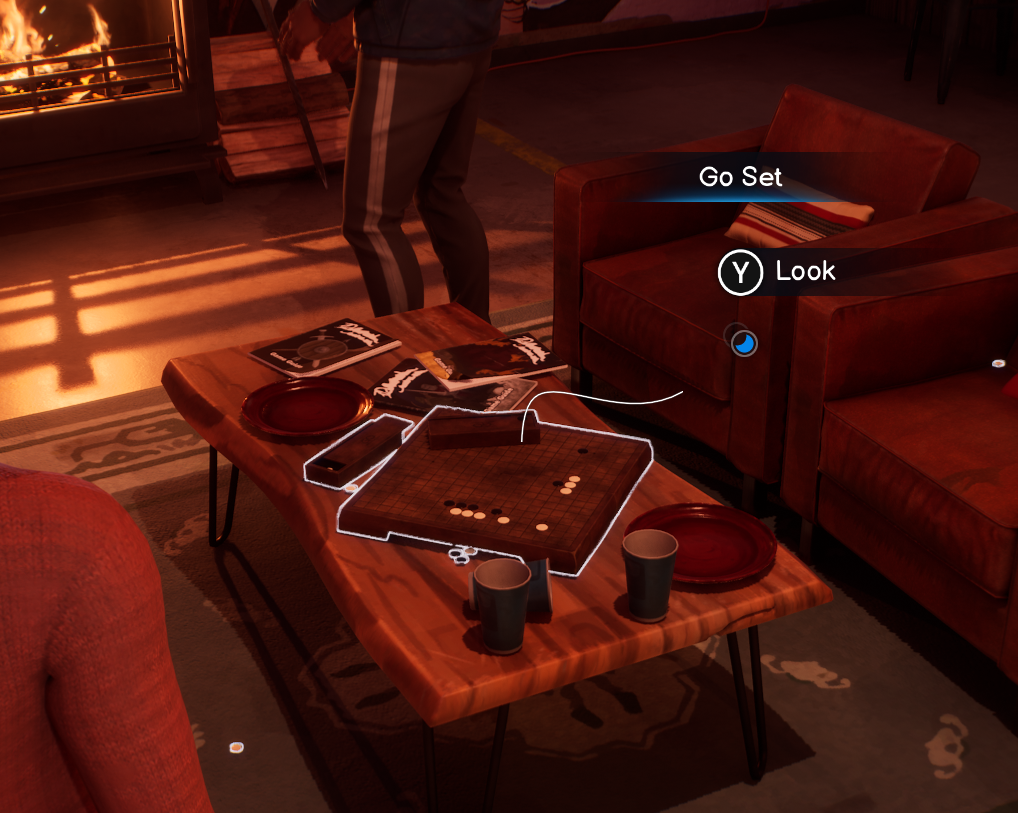
Verb hierarchy system: (left) 'Examine' signals critical path, (center) 'Examine' with secondary 'Action' verb, (right) 'Look' indicates optional exploration—consistent language guides player progression
Results
Tangible Outcomes
Scale of Work: Personally polished approximately 400 hotspots. The strike team collectively addressed ~1100-1200 hotspots (nearly all interaction points in the game) over 2 months.
Playtest Impact: Playtest "pain scores" related to interaction confusion and progression blocking were dramatically reduced. While I don't have exact metrics, the feedback shift was substantial—players could navigate scenes and understand their objectives without hitting the frustration points that plagued earlier tests.
Bug Reduction: Hotspot-related bugs decreased significantly. I became the designated "hotspot guy" for the remainder of development, providing continuity and expertise that kept the system stable through final polish.
Team Morale: Completing the strike team raised general morale. The game felt cohesive and intentional. The team could trust that interactions worked consistently across all scenes. Design's eagerness to address issues also helped build trust in the Design team as ready to tackle any problem and make things work.
Key Lessons Learned
Workflow Matters as Much as Design
Splitting work by location rather than scene size wasn't just faster—it was smarter. Context-switching between disparate environments reset my mental model of "what feels right here." Staying in one location let me build intuition, which accelerated decision-making and improved consistency.
Playtesting Drives Everything
Playtesting drove 100% of my volume adjustments. The focus was two-fold: maintaining a first-time player perspective (constantly asking "why would the player look this way?"), and seeing the actual impact of changes. Without playing the scene, you're just adjusting numbers blindly.
Systems Constraints Reveal Design Opportunities
The manual, time-intensive nature of hotspot setup exposed clear pipeline inefficiencies. As I worked through hundreds of hotspots, I documented patterns: what took too long, what was error-prone, what could be automated. This wasn't just complaint—it was gathering evidence for future advocacy. When the opportunity arose to influence our next project's pipeline, I had concrete examples of designer time-sinks and specific suggestions for improvement. Polish work isn't just about fixing the current game—it's about learning what systems need to evolve.
Pipeline Impact
The challenges surfaced during this work directly informed studio pipeline improvements for our next project:
Hotspots created automatically during script import
Improved actor organization in-engine for faster setup
Custom blocking volumes for line-of-sight hiding
Actor swap controllers replacing complex material swaps for variable-driven environment changes
The depth of understanding I gained during the polish pass positioned me to be a strong advocate for these improvements. When engineering developed automation for script import, I could provide specific design feedback on workflow pain points—prioritizing designer time-savings. Engineering asked, and I was ready with answers that extended beyond just the hotspot system.
Conclusion
By establishing systematic interaction principles and iterating through playtesting, the hotspot polish pass contributed to the broader effort of creating cohesive player guidance across Life is Strange: Double Exposure. The three-tier proximity system, verb hierarchy, and breadcrumbing methods didn't just reduce bugs—they built player trust in how the game communicates. Every hotspot became an intentional part of the narrative flow rather than a potential point of friction. The lessons learned continue to influence how our studio approaches player-facing systems design, proving that systematic polish work has impact far beyond the immediate project.
Polished hotspot system in action: players discover content naturally through progressive UI disclosure, clear verb hierarchy, and breadcrumbing—no tutorial needed.